Plotly Express#
Plotly is a data visualisation and application building library that allows you to create interactive charts and applications in Python. It is made up of four parts:
An Express library for creating quick visuals.
A Graph Objects library for more comprehensive and detailed plots.
A Figure Factory for generating very specific pre-made visualisations that would take a long time to code in express or graph objects
A Dash library, that can be used to build interactive applications and dashboards
Every Plotly Express and Figure Factory function uses Graph Objects under the hood. Dash runs independently and acts as a wrapper around Graph Objects to handle the interactivity between graphs.
We will be predominantly working with the Pandas library and Plotly Express libraries for this workbook; to import these we run the below code. It is common to abbreviate Plotly Express to px, and in most examples you find online this is how it will be named.
import pandas as pd
import plotly.express as px
We are going to be using data from NHS England on AE attendances and Emergency Admissions. The file Monthly -AE-Time-Series-March-2024.xls is located here https://www.england.nhs.uk/statistics/statistical-work-areas/ae-waiting-times-and-activity/, but for ease we have saved a copy in the data folder.
df = pd.read_csv('data/ae_data.csv')
We should check to ensure that the data has uploaded correctly, to do this we call the assigned dataframe df.
df
and we can check the format with
df.info()
It is quite common to have issues with dates when using Python graphing library’s, this is due to the wide range of date formats, you should correct this before trying to plot with dates using the pd.to_datetime function in Pandas.
df['month'] = pd.to_datetime(df['month'], dayfirst=True)
We want to create a line chart based on the month (x-axis) and ae_type_1 & emergency_admissions_via_type_1 (y-axis), Plotly Express allows us to work with long data. Therefore, we can pass the entire dataframe and call the columns explicitly. Just as a reminder, let’s refresh what we mean by long and wide data.
Long and wide dataframes:
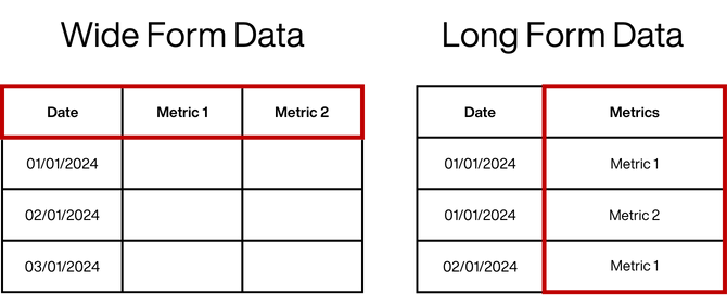
In a wide dataframe, each observation is represented by a single row, and each metric/variable is represented by a separate column.
In a long dataframe, each observation is represented by multiple rows, and each metric/variable is represented by one or more columns.
A concept you may see in many examples is the use of figures, for plotly express it is not required, however it is good practice and required for using more complex libraries like graph objects, we will come back to this later.
Pass the entire dataframe, the x-axis value and the y-axis value.
fig = px.line(data_frame=df, x='month', y=['ae_type_1', 'emergency_admissions_via_type_1'])

fig.show()
Now let’s apply some of our graphing theory to improve this chart.
Layout Options#
Applying Themes and Adding a Title
We use fig.update_layout for adding general figure elements and properties. For now, we will add a title and look at some different theme options.
There are a number of themes available in plotly.
themes_available = ['ggplot2', 'seaborn', 'simple_white', 'plotly', 'plotly_white',
                    'plotly_dark', 'presentation', 'xgridoff', 'ygridoff', 'gridon', 'none']
Let’s use a loop to take a look at the differences between these themes:
for i in themes_available: # loop through the list of themes

    fig = px.line(data_frame=df,
                  x='month',
                  y=['ae_type_1', 'emergency_admissions_via_type_1'])

    fig.update_layout(template=i, # apply theme
                      title=i + ' Theme') # adding a title

    fig.show() # show the plot
We will continue to work with the xgridoff theme for our example.
Resizing
We can also resize the figure’s height, width, and margin space surrounding the chart.
We will also set the location of the main title to be central.
fig = px.line(data_frame=df,
              x='month',
              y=['ae_type_1', 'emergency_admissions_via_type_1'])

fig.update_layout(template='xgridoff',
                  title='AandE Attendances and Admissions by Type',
                  title_x=0.5, # position the title
                  height=500, # setting the height
                  width=900, # setting the width
                  margin=dict(r=10) # setting the margin space bottom, top, left, right
                 )

fig.show()
Fonts
There are a number of fonts available to use in plotly.
The font parameter is also part of fig.update_layout.
Let’s take a look at the different fonts available. It is possible to access more fonts, however you will need to have a good understanding of HTML, Bootstrap and CSS.
fonts_available =  ['Arial', 'Balto', 'Courier New', 'Droid Sans', 'Droid Serif',
                    'Droid Sans Mono', 'Gravitas One', 'Old Standard TT', 'Open Sans',
                    'Overpass', 'PT Sans Narrow', 'Raleway', 'Times New Roman']
for i in fonts_available: # loop through the list of fonts

    fig = px.line(data_frame=df,
                  x='month',
                  y=['ae_type_1', 'emergency_admissions_via_type_1'])

    fig.update_layout(template='xgridoff',
                      title='AandE Attendances and Admissions - using <b>' + i + ' font </b>', # use tags to make text bold
                      title_x=0.5,
                      font_family=i,
                      height=500,
                      width=950,
                      margin=dict(r=10)
                      )

    fig.show()
We will select the Arial font going forward and remove the bold tags that were added to the title.
Axis Titles
By default, the axis labels are automatic based on the dataframe column names. This can be changed using fig.update_xaxes and fig.update_yaxes or can also be added the fig.update_layout using the xaxis and yaxis dictionary.
fig = px.line(data_frame=df,
                  x='month',
                  y=['ae_type_1', 'emergency_admissions_via_type_1'])

fig.update_layout(template='xgridoff',
                  title='AandE Attendances and Admissions by Type',
                  title_x=0.5,
                  font=dict(),
                  xaxis=dict(title='Month'), # add X axis title
                  yaxis=dict(title='Number of Attendances/Admissions'), # add X axis title
                  height=500,
                  width=950,
                  margin=dict(r=10)
                 )

fig.show()
Activity:
Using what we have learnt so far with px.line and fig.update_layout, create a chart with two traces by ‘month’ using two different columns from the dataframe.
Include the following:
Apply a theme.
Set the height and width of the figure.
Apply a font the figure.
Set the axis titles.
# Your code here
Adding Lines and Fill Areas#
Lines
Vertical and horizontal lines can help with communicating key change points in the data and baselines.
For vertical lines use
fig.add_vline.For horizontal lines use
fig.add_hline.
fig = px.line(data_frame=df,
                  x='month',
                  y=['ae_type_1', 'emergency_admissions_via_type_1'])

# Adding a vertical line
fig.add_vline(x='2020-04-01',
              line_width=2,
              line_color='black' )

fig.update_layout(template='xgridoff',
                  title='AandE Attendances and Admissions by Type',
                  title_x=0,
                  font=dict(),
                  xaxis=dict(title='Month'),
                  yaxis=dict(title='Number of Attendances/Admissions'),
                  height=500,
                  width=950,
                  margin=dict(r=10)
                 )

fig.show()
Let’s change the type of vertical line from solid to dashed.
fig = px.line(data_frame=df,
                  x='month',
                  y=['ae_type_1', 'emergency_admissions_via_type_1'])

# changing the type of vertical line to a dashed line - use "dot" for a dotted line
fig.add_vline(x='2020-04-01',
              line_width=2,
              line_color='black',
              line_dash="dash",
             )

fig.update_layout(template='xgridoff',
                  title='AandE Attendances and Admissions by Type',
                  title_x=0.5,
                  font=dict(),
                  xaxis=dict(title='Month'),
                  yaxis=dict(title='Number of Attendances/Admissions'),
                  height=500,
                  width=950,
                  margin=dict(r=10)
                 )

fig.show()
Fill Areas
Another option is to add shaded areas to highlight specific sections of note.
To do this we use fig.add_vrect (or for a horizontal shaded area use fig.add_hrect).
fig = px.line(data_frame=df,
                  x='month',
                  y=['ae_type_1', 'emergency_admissions_via_type_1'])

# add vertical shaded area
fig.add_vrect(x0="2020-02-01",
              x1="2021-05-01",
              annotation_text="Covid",
              annotation_position="top left",
              fillcolor="green",
              opacity=0.25,
              line_width=0)

fig.update_layout(template='xgridoff',
                  title='AandE Attendances and Admissions by Type',
                  title_x=0.5,
                  font=dict(),
                  xaxis=dict(title='Month'),
                  yaxis=dict(title='Number of Attendances/Admissions'),
                  height=500,
                  width=950,
                  margin=dict(r=10)
                 )

fig.show()
Activity
Beginner:
Add a dashed horizontal line at 1.8M to indicate the peak of activity during Covid for traceae_type_1.
Advanced: Add a dotted line at the equivalent peak for the second trace emergency_admissions_via_type_1.
# Your code here
Adding Annotation#
Next we are going to add some annotation text to the chart and also demonstrate adding colour background to the annotations in three different ways:
by naming the colour with literal names
by the RGB (red, green, blue) value and
by using the hexadecimal (hex) value for the same colour.
Static colours are the literal name of the colour, for example ‘blue’. While easy to understand this way of assigning colours is very limited and only really useful if you want either a white or black item.
RGB codes define the red, green and blue required to create the colour, you can also specify the transparency in the fourth slot. The same colour above in RGB would be rgb(0, 128, 255) I could then make this have 50% opacity using rgb(0, 128, 255, .5)
Hex codes begin with a # and are followed by a blend of 6 numbers or letters: For example a blue colour code would look like #0080ff. You can add two additional characters to define the opacity.
fig = px.line(data_frame=df,
              x='month',
              y=['ae_type_1', 'emergency_admissions_via_type_1'])

fig.add_vrect(x0="2020-02-01",
              x1="2021-05-01",
              annotation_text="Covid",
              annotation_position="top left",
              fillcolor="green",
              opacity=0.25,
              line_width=0)

# Add annotations to the chart
fig.add_annotation(x='2020-04-01',  # position of arrow head in the x-axis
                   y=680_000,       # position of arrow head in the y-axis
                   text="First Lockdown", # annotation text
                   showarrow=True, # show arrow
                   arrowhead=1, # apply arrow head style (integer between 0 - 8)
                   ay='-30', # relative position from arrow point in the y-axis
                   ax='-60', # relative position from arrow point in the x-axis
                   bgcolor='lightblue') # annotation background colour set as colour name

fig.add_annotation(x='2020-11-01',
                   y=1_030_000,
                   text="Second Lockdown",
                   showarrow=True,
                   arrowhead=1,
                   ay='-30',
                   ax='90',
                   bgcolor='rgb(173, 216, 230)') # the same annotation background colour
                                                 # set as Red/Green/Blue also known as RGB

fig.add_annotation(x='2021-02-01',
                   y=903_000,
                   text="Third Lockdown",
                   showarrow=True,
                   arrowhead=1,
                   ay='25',
                   ax='70',
                   bgcolor='#ADD8E6') # the same annotation background colour set as hex - this is the preferred option

fig.update_layout(template='xgridoff',
                  title='AandE Attendances and Admissions by Type',
                  title_x=0.5,
                  font=dict(),
                  xaxis=dict(title='Month'),
                  yaxis=dict(title='Number of Attendances/Admissions'),
                  height=500,
                  width=950,
                  margin=dict(r=10)
                 )

fig.show()
Using Text Annotation Explaining the Visualisation
Like before with adding annotations to indicate points of interest, fig.add_annotation can also be used to add general explanation text to the chart.
To declutter the chart, we will remove the ‘second lockdown’ annotation.
fig = px.line(data_frame=df,
              x='month',
              y=['ae_type_1', 'emergency_admissions_via_type_1'])

fig.add_vrect(x0="2020-02-01",
              x1="2021-05-01",
              annotation_text="Covid",
              annotation_position="top left",
              fillcolor="green",
              opacity=0.25,
              line_width=0)

# Annotation to describing the chart.
fig.add_annotation(x='2014-02-01',
                   y=850_000,
                   text="Type One AE attendances and admissions <br>"
                        "from Aug 2010 to Mar 2024",
                   showarrow=False,)

fig.add_annotation(x='2020-04-01',
                   y=680_000,
                   text="First Lockdown",
                   showarrow=True,
                   arrowhead=1,
                   ay='-30',
                   ax='-60',
                   bgcolor='lightblue')

fig.add_annotation(x='2021-02-01',
                   y=903_000,
                   text="Last Lockdown",
                   showarrow=True,
                   arrowhead=1,
                   ay='25',
                   ax='70',
                   bgcolor='#ADD8E6')

fig.update_layout(template='xgridoff',
                  title='AandE Attendances and Admissions by Type',
                  title_x=0.5,
                  font=dict(),
                  xaxis=dict(title='Month'),
                  yaxis=dict(title='Number of Attendances/Admissions'),
                  height=500,
                  width=950,
                  margin=dict(r=10)
                 )

fig.show()
Activity
Add annotation to the chart from the last activity explaining the horizontal line(s) that were added.
# Your code here
Legend Settings#
The legend needs a title, and the placement can be specified to allow more room for the chart.
fig = px.line(data_frame=df,
              x='month',
              y=['ae_type_1', 'emergency_admissions_via_type_1'])

fig.add_vrect(x0="2020-02-01",
              x1="2021-05-01",
              annotation_text="Covid",
              annotation_position="top left",
              fillcolor="green",
              opacity=0.25,
              line_width=0)

fig.add_annotation(x='2014-02-01',
                   y=850_000,
                   text="Type One AE attendances and admissions <br>"
                        "from Aug 2010 to Mar 2024",
                   showarrow=False,)

fig.add_annotation(x='2020-04-01',
                   y=680_000,
                   text="First Lockdown",
                   showarrow=True,
                   arrowhead=1,
                   ay='-30',
                   ax='-60',
                   bgcolor='lightblue')

fig.add_annotation(x='2021-02-01',
                   y=903_000,
                   text="Last Lockdown",
                   showarrow=True,
                   arrowhead=1,
                   ay='25',
                   ax='70',
                   bgcolor='#ADD8E6')

fig.update_layout(template='xgridoff',
                  title='AandE Attendances and Admissions by Type',
                  title_x=.5,
                  font=dict(),
                  xaxis=dict(title='Month'),
                  yaxis=dict(title='Number of Attendances/Admissions'),
                  height=500,
                  width=950,
                  margin=dict(r=10),
                  legend=dict(title='Patient Type', # Adding a title to the legend
                              x=0, # x position
                              y=-0.35, # y position
                              bordercolor="Black", # border color
                              borderwidth=1) # border thickness
                 )

fig.show()
Trace Types#
Let’s make our graph more complex and change one of the traces to a bar chart.
fig = px.line(data_frame=df,
              x='month',
              y=['ae_type_1']) # remove the second trace from here and replace it with the below.

# change the second trace from line to bar
fig.add_bar(x=df['month'],
            y=df['emergency_admissions_via_type_1'],
            name='ae admission via type 1', # specify the name for the legend
            marker_color='#d1495b'), # specify the colour of the bars

fig.add_vrect(x0="2020-02-01",
              x1="2021-05-01",
              annotation_text="Covid",
              annotation_position="top left",
              fillcolor="green",
              opacity=0.25,
              line_width=0)

fig.add_annotation(x='2014-02-01',
                   y=850_000,
                   text="Type One AE attendances and admissions <br>"
                        "from Aug 2010 to Mar 2024",
                   showarrow=False,)

fig.add_annotation(x='2020-04-01',
                   y=680_000,
                   text="First Lockdown",
                   showarrow=True,
                   arrowhead=1,
                   ay='-30',
                   ax='-60',
                   bgcolor='lightblue')

fig.add_annotation(x='2021-02-01',
                   y=903_000,
                   text="Last Lockdown",
                   showarrow=True,
                   arrowhead=1,
                   ay='25',
                   ax='70',
                   bgcolor='#ADD8E6')

fig.update_layout(template='xgridoff',
                  title='AandE Attendances and Admissions by Type',
                  title_x=.5,
                  font=dict(),
                  xaxis=dict(title='Month'),
                  yaxis=dict(title='Number of Attendances/Admissions'),
                  height=500,
                  width=950,
                  margin=dict(r=10),
                  legend=dict(title='Patient Type',
                              x=0,
                              y=-0.35,
                              bordercolor="Black",
                              borderwidth=1)
                 )

fig.show()
Activity:
Using the demonstrated example above,
add
ae_type_2as and additional a line trace.add
'emergency_admissions_via_type_2'as an additional bar trace.
Ensuring that each trace has a different colour.
The resulting figure will then have a total of four traces. Two lines traces - ‘ae_type_1’ and ‘ae_type_2’ and two bar traces - ‘emergency_admissions_via_type_1’ and ‘emergency_admissions_via_type_2’.
Note: The ‘emergency_admissions_via_type_2’ trace has a small scale. As Plotly charts are interactive, use the ‘cross-hairs’ to zoom in on the figure to check that the bars are there!
To zoom back out again, double click anywhere on the figure.
# Your code here
Standardising & Common Scales#
It is common to see graphs with altered axis, this is useful for seeing small fluctuations in data when scales are large. However, if used inconsistently it is likely to lead to misinterpretation of data. It is recommended to limit the use of manipulated scales where possible, and if it is required to do it consistently. If that is not possible then you should ensure you have made it clear to the reader that the scale on that graph is different to the other graphs.
For this example, lets ensure that the y-axis starts from zero.
fig = px.line(data_frame=df,
              x='month',
              y=['ae_type_1'])

# change the second trace from line to bar
fig.add_bar(x=df['month'],
            y=df['emergency_admissions_via_type_1'],
            name='ae admission via type 1', # specify the name for the legend
            marker_color='#d1495b'), # specify the colour of the bars

fig.add_vrect(x0="2020-02-01",
              x1="2021-05-01",
              annotation_text="Covid",
              annotation_position="top left",
              fillcolor="green",
              opacity=0.25,
              line_width=0)

fig.add_annotation(x='2014-02-01',
                   y=850_000,
                   text="Type One AE attendances and admissions <br>"
                        "from Aug 2010 to Mar 2024",
                   showarrow=False,)

fig.add_annotation(x='2020-04-01',
                   y=680_000,
                   text="First Lockdown",
                   showarrow=True,
                   arrowhead=1,
                   ay='-30',
                   ax='-60',
                   bgcolor='lightblue')

fig.add_annotation(x='2021-02-01',
                   y=903_000,
                   text="Last Lockdown",
                   showarrow=True,
                   arrowhead=1,
                   ay='25',
                   ax='70',
                   bgcolor='#ADD8E6')

fig.update_layout(template='xgridoff',
                  title='AandE Attendances and Admissions by Type',
                  title_x=.5,
                  font=dict(),
                  xaxis=dict(title='Month'),
                  yaxis=dict(title='Number of Attendances/Admissions',
                            rangemode="tozero"), # set the y-axis to start from zero
                  height=500,
                  width=950,
                  margin=dict(r=10),
                  legend=dict(title='Patient Type',
                              x=0,
                              y=-0.35,
                              bordercolor="Black",
                              borderwidth=1)
                 )

fig.show()
Reasonable Demands#
Now we are going to add a slider to make the chart more interactive and allow the user to focus on areas of interest.
Note that the position of the legend also needs to be adjusted to cater for the slider.
fig = px.line(data_frame=df,
              x='month',
              y=['ae_type_1'])

fig.add_bar(x=df['month'],
            y=df['emergency_admissions_via_type_1'],
            name='ae admission via type 1',
            marker_color='#d1495b'),

fig.add_vrect(x0="2020-02-01",
              x1="2021-05-01",
              annotation_text="Covid",
              annotation_position="top left",
              fillcolor="green",
              opacity=0.25,
              line_width=0)

fig.add_annotation(x='2014-02-01',
                   y=850_000,
                   text="Type One AE attendances and admissions <br>"
                        "from Aug 2010 to Mar 2024",
                   showarrow=False,)

fig.add_annotation(x='2020-04-01',
                   y=680_000,
                   text="First Lockdown",
                   showarrow=True,
                   arrowhead=1,
                   ay='-30',
                   ax='-60',
                   bgcolor='lightblue')

fig.add_annotation(x='2021-02-01',
                   y=903_000,
                   text="Last Lockdown",
                   showarrow=True,
                   arrowhead=1,
                   ay='25',
                   ax='70',
                   bgcolor='#ADD8E6')

fig.update_layout(template='xgridoff',
                  title='AandE Attendances and Admissions by Type',
                  title_x=.5,
                  font=dict(),
                  xaxis=dict(title='Month',
                            rangeslider=dict(visible=True), # add x axis range slider
                             type="date"),                   # add x axis range slider),
                  yaxis=dict(title='Number of Attendances/Admissions',
                            rangemode="tozero"),
                  height=500,
                  width=950,
                  margin=dict(r=10),
                  legend=dict(title='Patient Type',
                              x=0,
                              y=-0.65, # y position changed to cater for the slider
                              bordercolor="Black",
                              borderwidth=1)
                 )

fig.show()
Capstone Activity - Plotly Express#
Now see if you can create an area chart based on the principles we have covered here.
Look for a source of data from:
An Example Area Chart
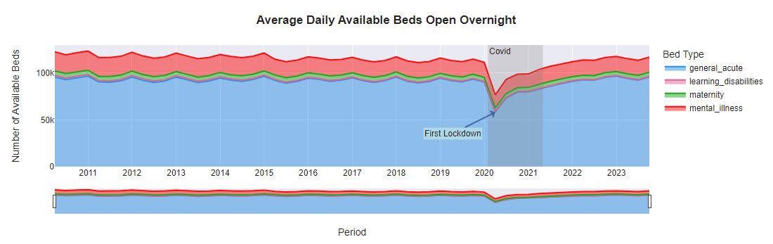
Here is an example of an area chart, using file: Beds Time-series 2010-11 onwards.xls taken from: https://www.england.nhs.uk/statistics/statistical-work-areas/bed-availability-and-occupancy/bed-availability-and-occupancy-kh03/
# Your code here